Palike
A mobile app that helps older adults connect in a safe and authentic way
- Type
- Academic project. End-to-end app + branding
- Duration
- 8 months
- Team
- 6 UX/UI designers
- Role
- UX Research, UX/UI Design, Branding, Prototyping, Accessibility
- Tools
- Figma, FigJam, Google Suite, Adobe Suite
Context
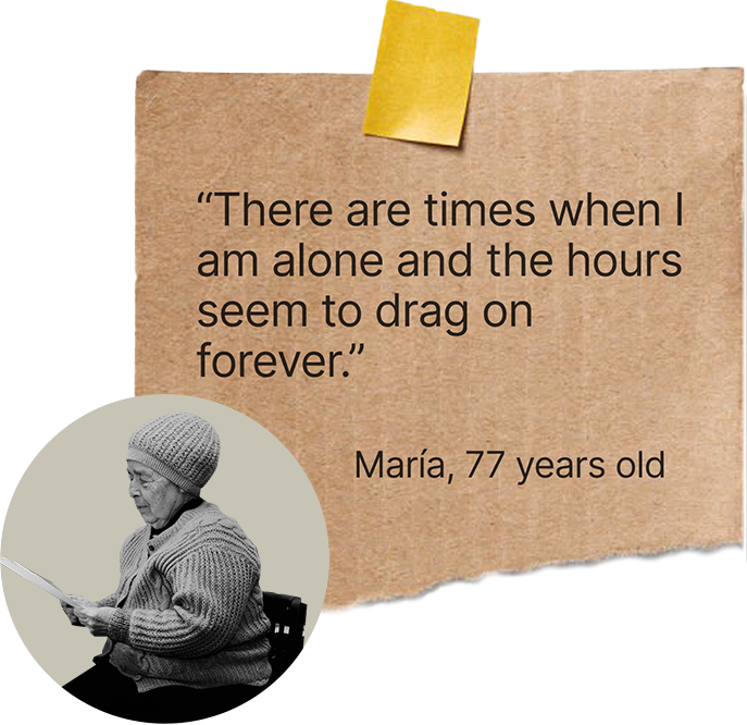
Loneliness among older adults is a growing issue, especially after retirement. Many live alone, with limited social contact, and find digital tools difficult to use or intimidating.
To address this we needed to understand their daily routines, fears, motivations and the role of technology in their lives.
Challenge
Our challenge was to design an inclusive solution that:
- Fits naturally into their daily routines.
- Feels safe and trustworthy.
- Encourages authentic social interaction, not just another chat app.
How might we create a safe and meaningful platform that helps older adults build real connections and reduce loneliness while keeping it simple and easy to use?
Design thinking process
- 01
Empathize
- Desk research
- Interviews
- Surveys
- Benchmark
- 02
Define
- Insights
- User persona
- User journey
- Value proposition
- User stories
- MVP
- 03
Ideation
- Task flow
- User flow
- UX sitemap
- Card sorting
- Navigation
- Tree testing
- Wireframes
- Cognitive biases
- 04
Design
- Naming
- Logo
- UI kit
- Accessibility
- 05
Test
- User tests
- Final design
- Results & learnings
Empathize
Understand the real needs, emotions and daily challenges of older adults who experience loneliness, and discover how technology could help them connect in a safe and comfortable way.
Desk research
Before designing anything… How much does loneliness affect older adults and why is it so persistent in our society?
 63%
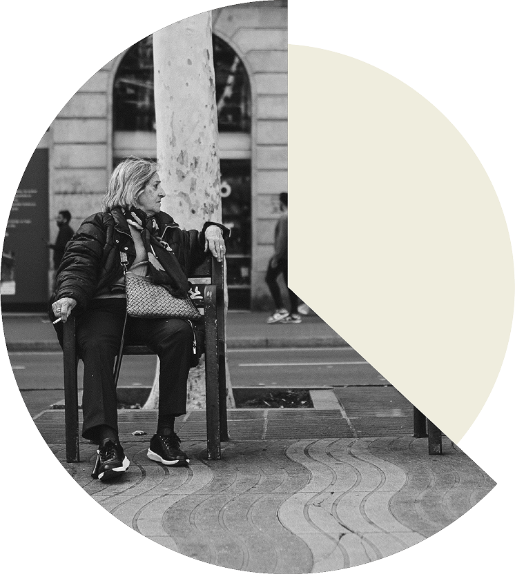
63%of the population has felt lonely.
 19%
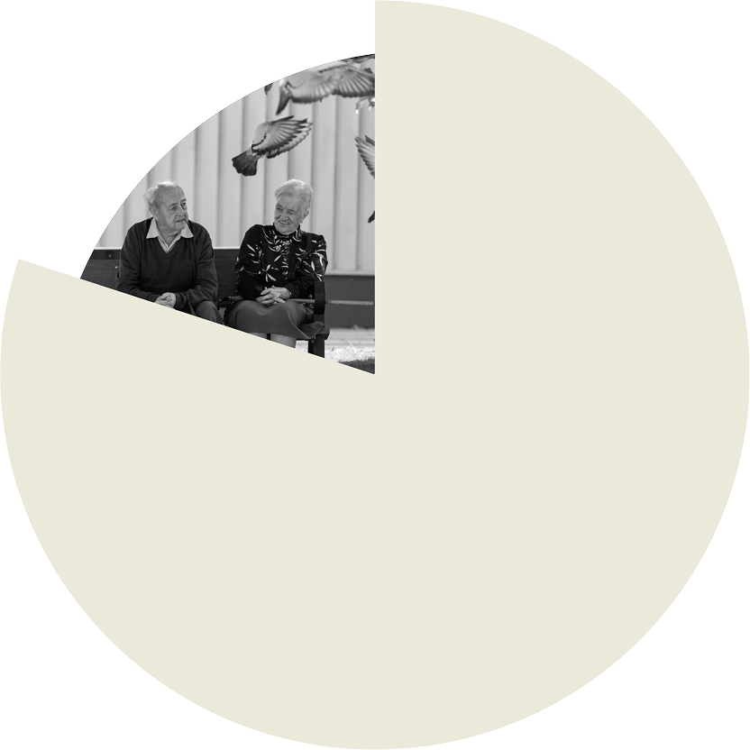
19%of the total population are older adults.
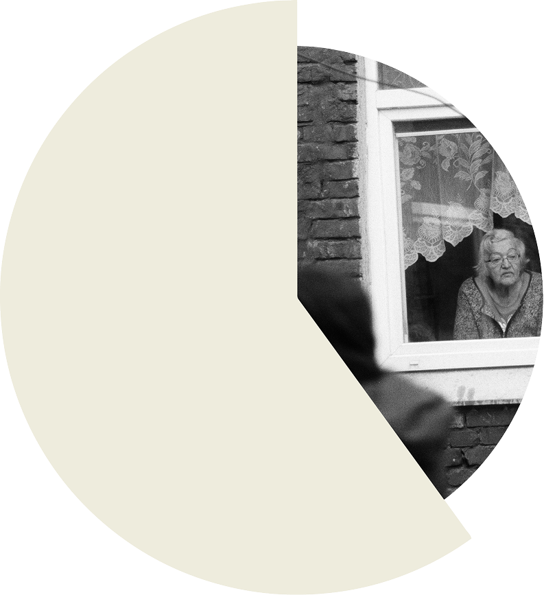 40%
40%of people over 65 feel lonely on a regular basis.
Silent epidemic
The vast majority of society (93.3%) considers loneliness in older adults to be an invisible problem.
A growing problem
In just two decades, 15% of the population will be over 65, and by the end of the century, nearly 25%.
Interviews
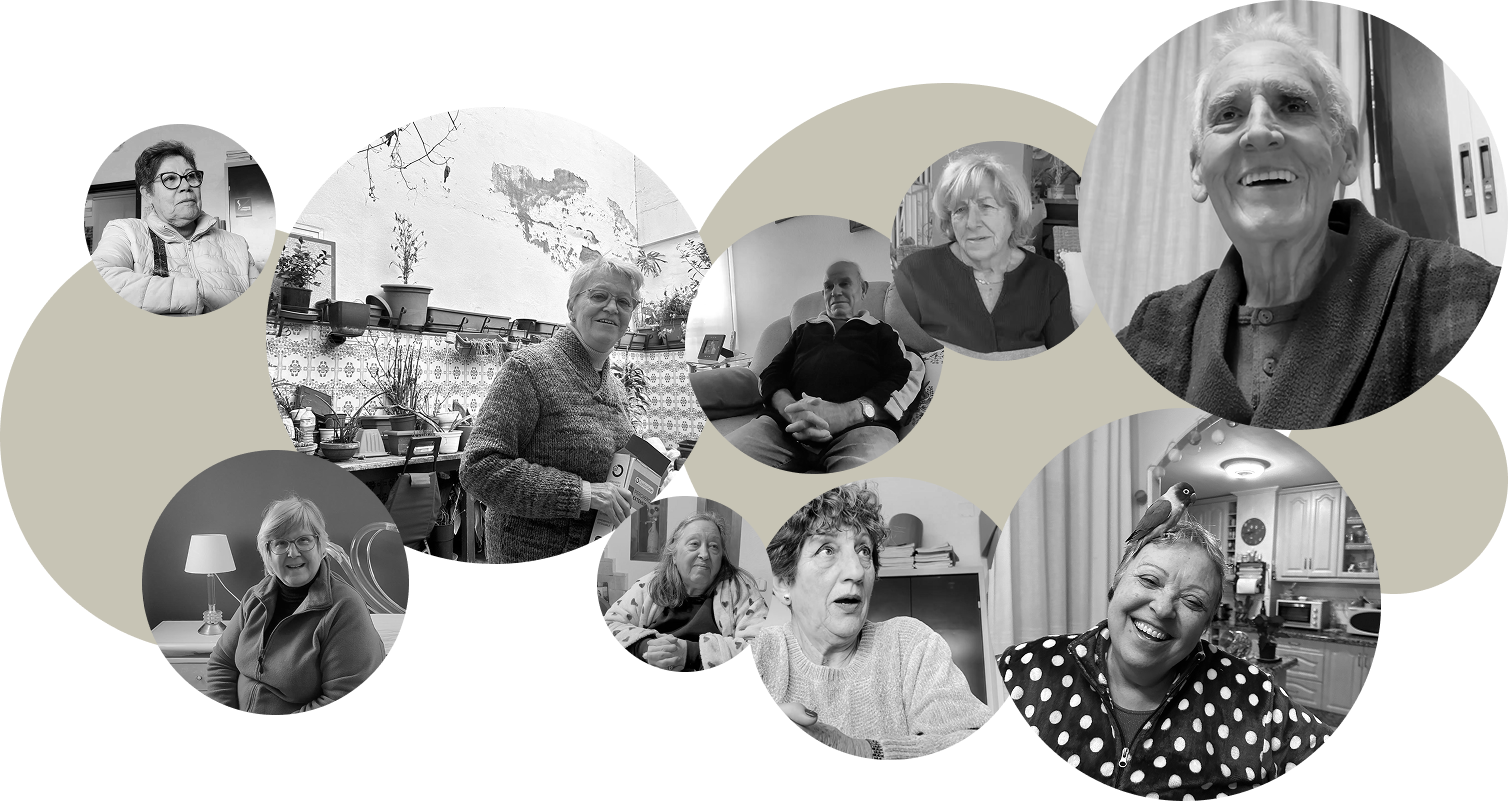
Research gave us context, but we needed voices. We sat down with older adults to learn more about them and their routines.
16 semi-structured interviews with people aged 60 to 80 from different backgrounds and lifestyles.
Goal: explore their routines, motivations and fears around social connection and technology.
What we learned
- They value companionship with people their age.
- Trust and safety come before any new interaction.
- They prefer simple and familiar interfaces.
- Some enjoy learning, but only at their own pace.
Surveys
Once we heard their stories we wanted to know if these patterns were shared. We gathered data to confirm which pain points were common.
We designed a 22-question survey to validate our interview insights. Only retired or pre-retired people could complete it. We received 99 valid responses.
Outcome
Many older adults don’t openly admit their loneliness but still long for meaningful connection. We validated our insights and confirmed we were addressing a real, deep need.
Benchmark
With this foundation, we looked outward. What solutions already exist and why are they not enough?
We analyzed existing apps for older adults.
Conclusion
Most existing solutions are not available locally, focus on different needs or do not fully address loneliness. Only a few come close to meeting the needs of older adults seeking meaningful social connections in an accessible and safe way.
Define
Identify the core problem behind older adults’ loneliness, define the user’s emotional and functional needs and translate research findings into a clear design focus.
Insights
What do all these stories have in common? We distilled the findings into insights that explained the emotional triggers behind loneliness.
Based on our research, we identified six key insights.

-
Chosen insight
Evenings
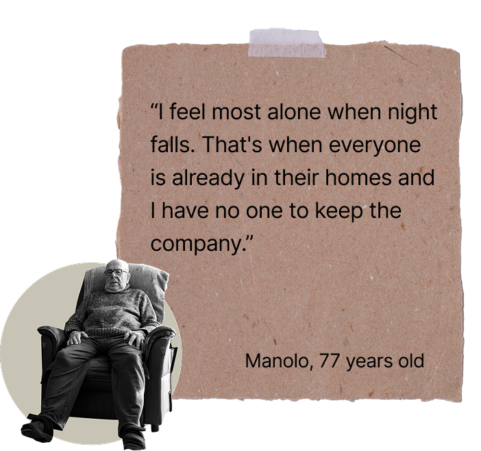
The end of the day is when loneliness feels strongest. When the house grows quiet, the emptiness becomes emotional.
-
Routine
Many have grown used to living alone, not because they want to, but because they fear new people may not fit into their lives.
-
Companionship
They enjoy being around people of similar age and background, and want to recreate the social life they had while working.
-
Feeling useful
Helping others or doing creative activities like crafts makes them feel valuable.
-
Health
Staying active, especially walking, is seen as the key to longevity and a daily responsibility.
-
Technology
They fear new digital tools because they feel insecure using them. Their main concern is privacy and data safety.
Chosen insight: evenings
We focused on evenings because it was the strongest emotional pain point. It was confirmed in interviews and supported by survey data: 43% of respondents said they feel most lonely during the afternoon and evening.
When the day slows down and the house gets quiet, feelings of emptiness become stronger.
User persona
To keep the project grounded we created a person we could design for, not an abstract profile.
La Sole
The warm grandma. The name comes from Soledad, a common name among older Spanish women that means “loneliness”.
- Age
- 66
- Gender
- Female
- City
- Plasencia, Spain
- Marital status
- Widow
- Living situation
- Alone
Personality
- Attitude: positive, independent, connected to family
- Values: warmth, creativity, purpose
- Needs: safe and simple ways to connect with others her age
Interests
- Crafting and handmade projects
- Chatting with neighbors
- Going for walks
- Watching her favorite TV dramas
User journey
A day in the life of Sole begins with a strong social component that fades throughout the day. Little by little, solitude takes centre stage as the afternoon goes on.
Value proposition
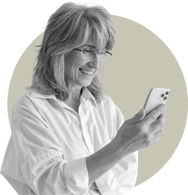
With the problem clear, we refined how Palike could offer real value: a safe space to connect, learn and feel accompanied.
We compared the customer profile with our value map to confirm that Palike addresses real pains, meaningful gains and the key tasks older adults want to accomplish.
Enable authentic and safe connections between older adults, matched to their interests and availability, so they can feel accompanied, fulfilled and emotionally connected.
User story map
These needs can be turned into simple statements that describe what users want to do and why it matters.
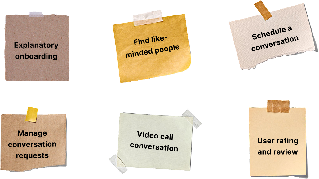
We built our user story map from a brainstorming session to identify the main actions users would take in the app. A rich ecosystem of ideas emerged: 9 user activities, 17 user tasks and more than 70 features.
MVP
Then came the filtering stage. What is essential and what can wait? We defined the core features.
We identified the minimum set of features that could deliver real value, support meaningful connections and stay accessible for older adults, prioritising user value, business value and technical feasibility. Everything else would come later.
Ideation
Translate research insights and user needs into tangible design solutions: clear tasks, flows and structures that let older adults connect safely through Palike.
Task flow
Now it is time to model actions. What steps should a user take to achieve their goals with clarity and minimal effort?
We defined a task flow based on the most critical journey: chat with someone who shares your interests at an agreed time. Along the way, we recorded every question that came up for the design process.
User flow
Then we connected these steps into a smooth path, so users always knew what to do next without pressure.
Our chosen user flow was too large, so we split it into four smaller ones for better analysis and translation into wireframes.
UX sitemap
To avoid confusion, we organised the entire structure of the app so users could understand it at a glance.
A major challenge for our content architecture: the app has no content as such. It is created by users themselves when they register, complete their profile and connect.
Card sorting
But structure is only useful if it matches the user’s mind. We asked participants to group concepts their own way to validate our architecture.
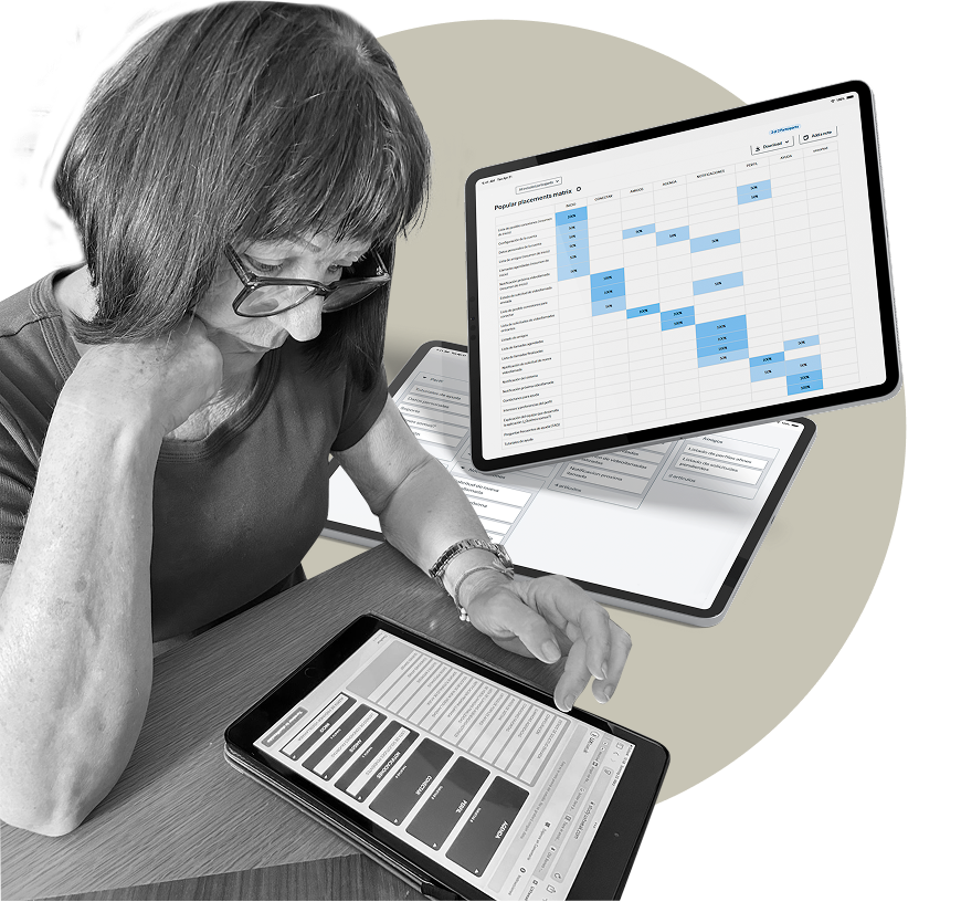
To verify our sitemap, we ran two card sorts.
Card sorting 1
The naming was confusing for users, so we changed it to make it more accessible.
Card sorting 2
We moved “List of incoming call requests”: most users placed it somewhere other than where we had it.
Navigation
With clarity as our priority, we designed a navigation system that is easy to follow, even for first-time users.
So that older adults can move through Palike effortlessly and confidently, we focused on a clear and intuitive navigation structure.
Tree testing
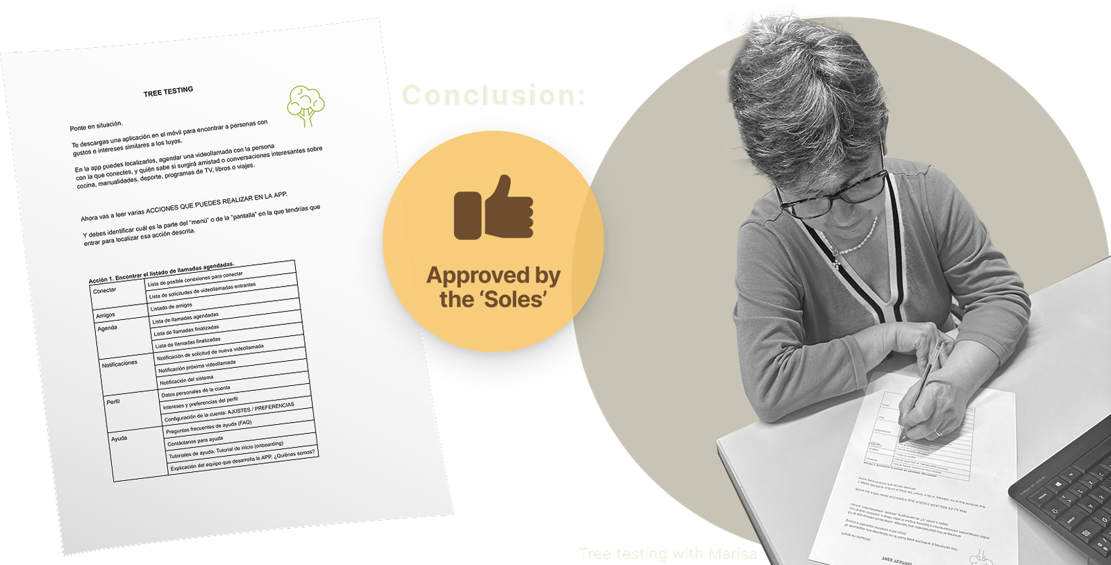
Did the logic work? Can users find what they need without thinking too much? This step helped us detect early confusion points.
One of our team members trains adults in digital skills, so she quickly brought together several women who were retired or close to retirement. With them we confirmed that the navigation was intuitive.
The result was very good: everyone completed the tasks with a high success rate, and they asked to be the first to try the app.
Wireframes
Once the structure was solid, we moved on to screens. Low and mid-fidelity layouts let us explore interactions and see what worked visually.
Cognitive biases
Small details influence behaviour. We simplified decisions, reduced cognitive load and added positive cues that made the experience more inviting.
We identified the biases that shape how older adults make decisions and adjusted key moments to guide them with clarity. Small cues helped reduce doubt and increase confidence. Here is a sample applied to our screens.
Design
Turn insights and flows into a cohesive visual identity and an accessible interface that feels friendly, trustworthy and easy to use for older adults.
Naming: why “Palike”?
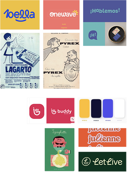
We wanted a name that felt close, familiar and meaningful. Something older adults could pronounce, understand, and smile at.
We picked a name that is short, easy to say and familiar for older adults. It needed to feel warm and friendly.
It comes from the Spanish word “palique”, which means light conversation. We adapted it to Palike to make it more modern and to hint at the English word “like”. The name reflects the two key ideas of the app: talking and connecting.
Logo
The logo is built on concepts that capture the essence of Palike: union, dialogue and the infinite. It reflects connection through simple conversation, joined in a continuous loop of support and companionship.

UI kit · Typography
We created a system based on clean typography, accessible colours and components designed for clarity and comfort.
Our main typeface is Gilroy in bold, used for the logo and all headings. It is modern and clean, with a subtle vintage touch from its geometric shapes that gives the project a warm, familiar character.
For body text we use Roboto. It stays readable at any size, which helps older adults who need clear spacing and simple letterforms.

UI kit · Colours
We reduced the palette to only the essential tones to lower visual load and create a cleaner interface. The primary colour is a strong, pleasant blue that conveys trust and calm, the same reason many banks and service companies use it.

Cataracts
We also considered age-related vision changes like cataracts, which add a yellow tint and make similar colours blend together. That’s why we avoided confusing pairs such as blue with purple or yellow with green.
Main UI components
Clear, consistent components guide actions, reduce effort and support a smooth experience across every screen. Here is a sample of the components used in the app.
Accessibility
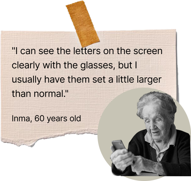
Accessibility and usability were priorities from day one because of who our users are. Technology has to be as easy to use as possible.
Older adults are often ignored in digital products, even though they are the fastest-growing group and need the most adaptation. We aimed to help them feel capable, independent and confident while using Palike.
Component design examples
Navigation support
Every navigation element was designed for older adults: a simple, predictable and reassuring experience where every action is clear and easy to undo, so users always know where they are and how to go back.
- Enough time to read.
- Specific confirmation for destructive actions.
- Simple actions.
- Ability to go back or undo an action.
Tests
Validate the prototype with real users, find friction points fast and refine the final design so older adults could navigate the app with clarity, confidence and ease.
User test: what we learned
We invited five older adults to try the prototype. Their feedback helped us adjust the design to their needs and language.
Our tone sounded too digital and they had trouble understanding certain things. They didn’t identify with the slang of social media, so we adapted it.
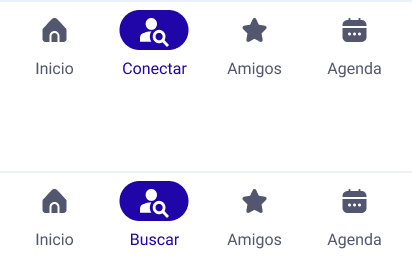
Connect → Search
The label “Conectar” (connect) caused confusion: some participants thought it meant “Amigos” (friends), so we replaced it with “Buscar” (search).
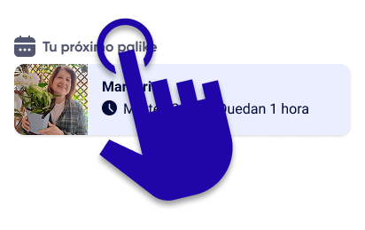
Section headers
Section headers on the home screen looked interactive. Participants tried to tap them, so we made them clickable.
Results & learnings
Bring the process full circle: check whether Palike answers the original challenge, capture what we learned as a team, and define what could come next.
Outcome
Did we solve what we set out to?
Palike gives older adults a safe way to connect right when loneliness hits hardest: the evenings. By matching people through shared interests rather than another generic chat format, it turns a quiet moment into real companionship.
- Navigation tested as intuitive for every participant.
- Testing caught and fixed two confusion points before the final prototype.
- Several participants asked to be the first to try it if it launches.
Key learnings
- Trust comes before visual polish.
- Small wording choices matter as much as layout.
- Early testing (card sorting, tree testing) saves rework later.
Next steps
- Test with a larger, more diverse group.
- Design a guided onboarding for first-time app users.
- Define safety and moderation for video calls.
And of course… thank you
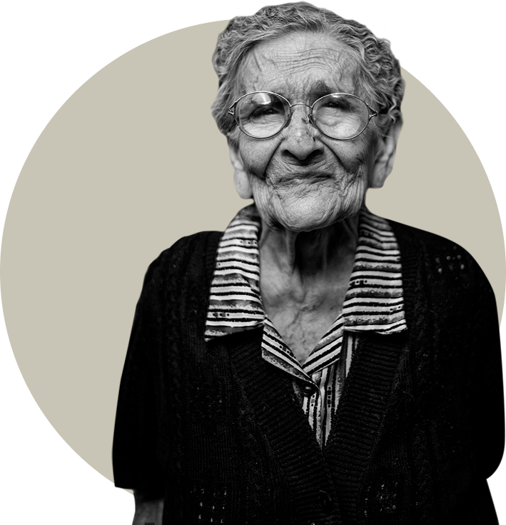
This project wouldn’t have been the same without the older adults who opened their homes, their stories and their time to us, starting with our own grandparents, whose patience and honesty shaped Palike from day one.
Working with older adults means slowing down, listening twice as carefully and questioning assumptions we didn’t know we had. What we take from this project isn’t just a prototype, but the warmth, patience and perspective everyone who took part shared with us.
Thank you to every person who sat down with us, tested our screens and trusted us with their stories.